This feature allows an Admin to create, edit or delete a chat button. The user can also customize an existing chat button.
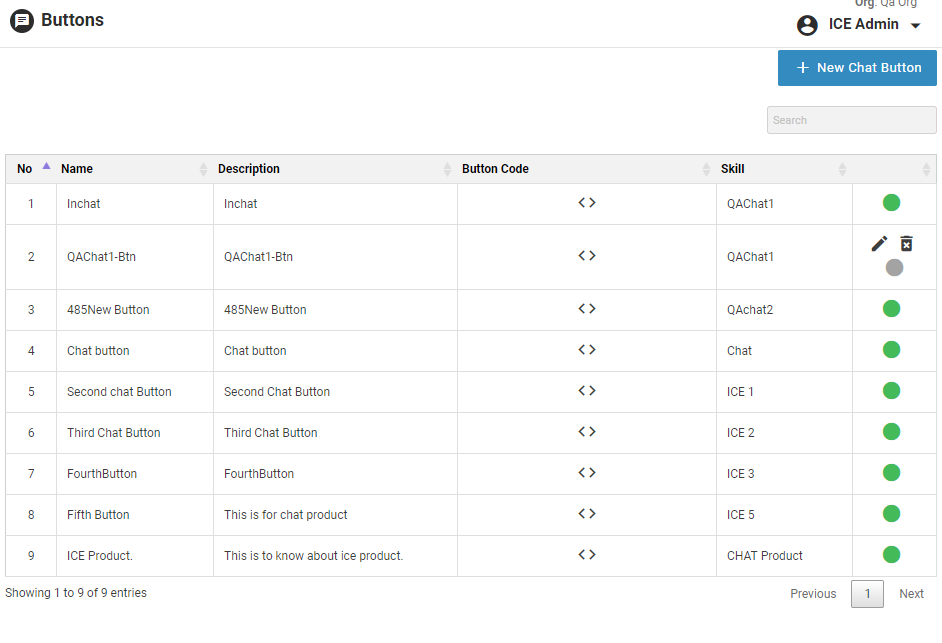
•To view or customize a chat button go to Settings>Chat>Customize Button and the following screen appears-
•Click  to create a new chat button and the following window appears on the screen-
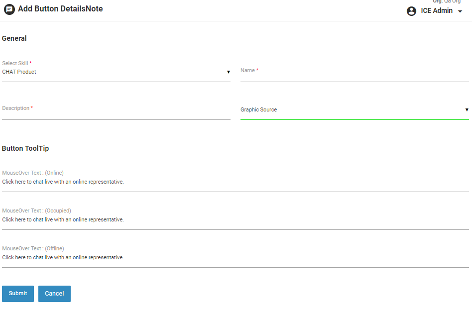
•The above screen includes the following elements-
| Screen Elements |
Description |
|
General
|
|
Skill
|
Select skill to created buttons based on skill.
|
|
Description
|
Provide description for the button.
|
|
Name
|
Provide name for the button.
|
|
Graphic Source
|
Select the source for the graphics of button from the following two options.
Available Options:
- Choose from Gallery
- Custom
|
|
Button Gallery (If Gallery is selected)
|
|
Button Category
|
Select the category for button from the dropdown list.
|
|
Shape
|
Select shape for the button from the dropdown list.
|
|
Color
|
Select color for the button from the dropdown list.
|
|
Status
|
- Online- Displays the status of operator as online/available with its associated chat button. Check the checkbox to set different online button for mobile.
- Offline- Displays the status of operator as offline/unavailable with its associated chat button. Check the checkbox to set different offline button for mobile.
- Occupied- Displays the status of operator as occupied/away with its associated chat button. Check the checkbox to set different occupied button for mobile.
|
|
Custom Button (If Custom is selected)
|
|
Online Source
|
If selected,
- Provide Online Image URL for the button. Check the checkbox to set different online chat button for mobile
- Provide Offline Image URL for the button. Check the checkbox to set different offline chat button for mobile
- Provide Occupied Image URL for the button. Check the checkbox to set different occupied chat button for mobile
- Select Floating for Desktop checkbox, if the button is to be kept floating for the desktop. Select position for the floating button. Also provide the figures in the respective fields.
- Select Floating for Mobile checkbox, if the button is to be kept floating for mobile devices. Select position for the floating button. Also provide the figures in the respective fields.
One can also see the preview of the buttons by clicking on Preview button.
|
|
Local Source
|
If selected,
- Provide Online Image URL for the button. Check the checkbox to set different online chat button for mobile
- Provide Offline Image URL for the button. Check the checkbox to set different offline chat button for mobile
- Provide Occupied Image URL for the button. Check the checkbox to set different occupied chat button for mobile
- Select Floating for Desktop checkbox, if the button is to be kept floating for the desktop. Select position for the floating button. Also provide the figures in the respective fields.
- Select Floating for Mobile checkbox, if the button is to be kept floating for mobile devices. Select position for the floating button. Also provide the figures in the respective fields.
One can also see the preview of the buttons by clicking on Preview button. |
|
CSS Based
|
If selected,
- Provide the CSS code for Online button. Check the checkbox to set different online CSS for mobile
- Provide the CSS code for Offline button. Check the checkbox to set different offline CSS for mobile
- Provide the CSS code for Occupied button. Check the checkbox to set different occupied CSS for mobile
One can also see the preview of the buttons by clicking on Preview button. |
|
Button Tooltip
|
|
MouseOver Text (Online)
|
Provide text to be displayed when chat representative is online and visitor hovers the mouse on the Common button.
|
|
MouseOver Text (Occupied)
|
Provide text to be displayed when chat representative is occupied and visitor hovers the mouse on the Common button.
|
|
MouseOver Text (Offline)
|
Provide text to be displayed when chat representative is offline and visitor hovers the mouse on the Common button.
|